Plum
Positioning an investment instrument as a savings product. £100M in net deposits within the first month.

The Problem
Plum had grown quickly. Years of rapid expansion (into cryptocurrency, then equity trading) coupled with successive technology migrations had left the app's information architecture in a state that no longer reflected how customers thought about their money. Features were hard to find, and the distinctions between savings and investment products had become blurred.
This mattered because Plum's next move depended on it: launching a QMMF (Qualifying Money Market Fund) as a high-interest savings product, at a moment when interest rates were at their most competitive in years. The bet made sense: attract new customers with best-in-market savings rates, then convert them into the broader Plum ecosystem. But positioning an investment instrument as a savings account only works if users can clearly tell it apart from the other investment products sitting next to it. A confusing IA would undermine the entire proposition before it launched.
Rebuilding the Foundation
The first task was diagnosing the IA problem properly. We ran research to understand how customers actually navigated the app and where they expected to find specific features, not where the product had historically placed them.

A full feature audit produced a categorical view of every asset type, core function, and ancillary function in the app.
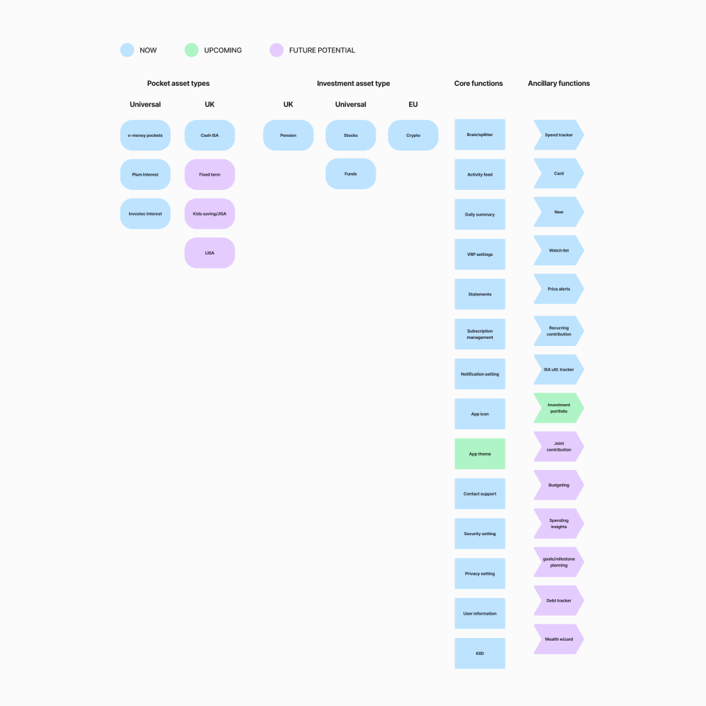
The findings informed a new information architecture designed to cleanly separate savings products from investment products and give each category a clear home. Tree testing and card sorting both returned task success rates above 90%. With that in place, the QMMF had a distinct, credible position in the app: a savings product, clearly separate from the investment instruments beside it.

Approach and Process
Depending on how well-understood a flow was, different levels of fidelity were used before committing to high-fidelity design work. The approach kept delivery fast while surfacing risks early.
Low confidence — Flow maps that outline key user and system touchpoints without screen layouts. The goal is to identify technical requirements and unknowns before any high-fidelity effort is committed. The Cash ISA transfer-out flow was handled this way: a new interaction in the Plum ecosystem that needed technical clarity before design work could begin.

Medium confidence — Flow maps with screen layouts, used to work through how backend logic is communicated to the user. The QMMF withdrawal flow was handled at this level: different withdrawal timelines applied depending on the withdrawal amount, and the approach helped visualise and validate that logic with stakeholders before high-fidelity work began.

High confidence — Screen designs created directly from established design system templates, skipping wireframes entirely. Used for well-understood flows like KYC, deposit journeys, and general navigation. When the design decisions are already solved, this approach delivers faster without sacrificing quality.

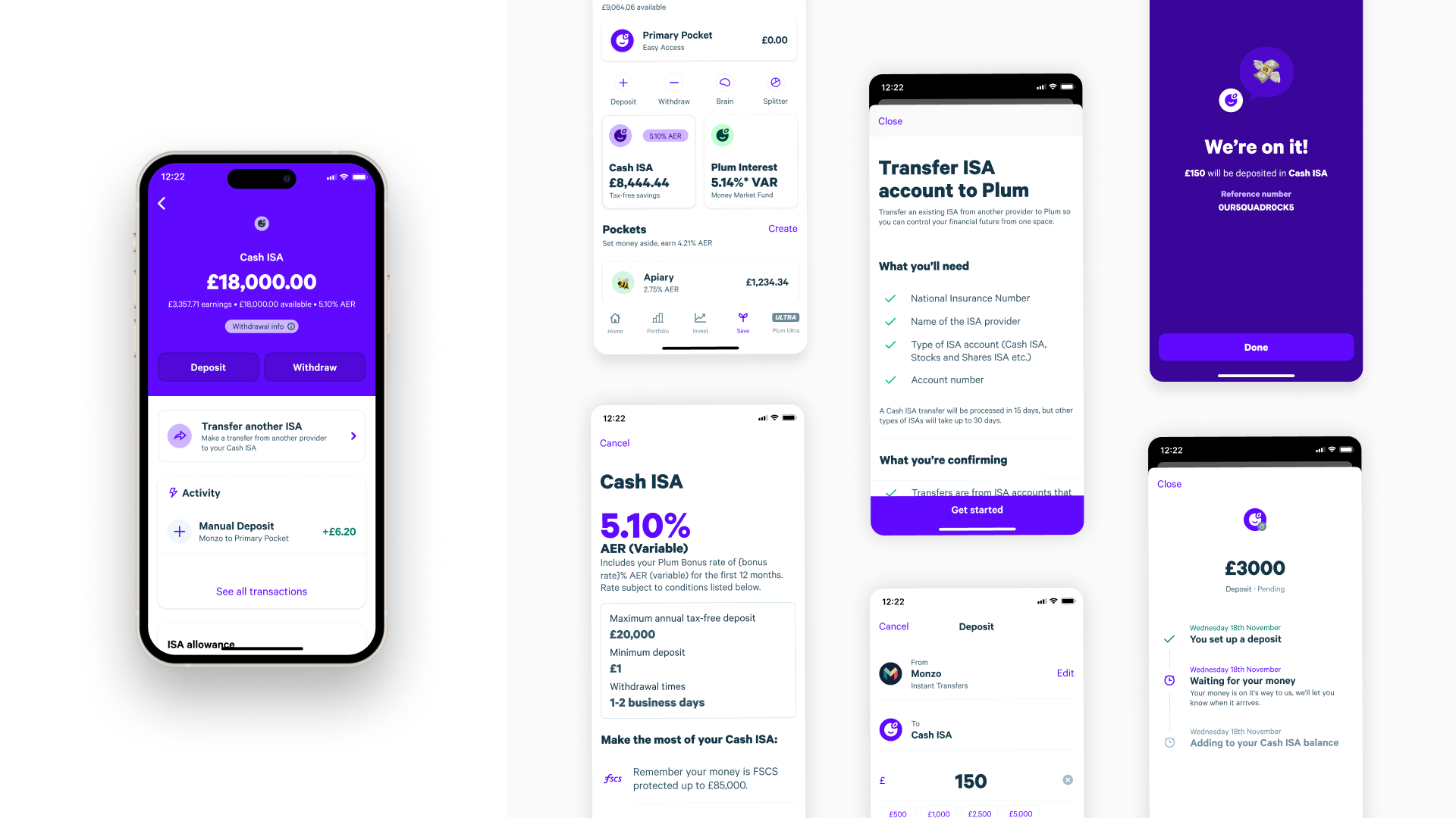
Designing the Product
With the IA settled, the QMMF and Cash ISA were designed end-to-end. Flow maps sketched the complete customer journey, reviewed with stakeholders for business and technical feasibility before moving into wireframes and high-fidelity prototyping. The goal was familiar: a straightforward savings product that happened to live inside an investment platform.
The Design System
Running alongside the IA and product work was a ground-up rebuild of Plum's design system. Years of tooling migrations and fast-moving feature work had left the existing system fragmented and unreliable, creating operational drag across both design and engineering.
The approach mirrored how any customer-facing product is built. Cross-discipline workshops between design, engineering, and product established shared principles, technical decisions, and business goals before anything was built.

Supernova was adopted as a single source of truth, with a process put in place to keep the Figma system in parity with production code. Atomic Design principles were applied throughout, with identical naming conventions across Figma and the developer codebase so both teams could speak the same language.


The Result
80% of new users made a deposit. The product generated £100M in net deposits within its first month. The design system is estimated to reduce design and development time by 20%, or around £250,000 per year in operational costs. Both calls turned out to be right: fixing the IA first, and positioning QMMF as savings.